Interview with Kirk Thornton | Department of Art & Art History Mississippi Flag Feature
This past June, in the wake of national change and public uprising, legislators from the state of Mississippi voted to remove the confederate iconography adorning the state flag and replace it with a new flag that more appropriately represents all of the people of Mississippi. A commission of nine representatives was established to oversee the process.
The commission opened the search up to the public, asking for anyone to submit a design that could potentially become a new rallying symbol for the state. The public submitted over 3,000 designs, which the committee narrowed down to 147 after the first round. Of those making it to the second round, former Graphic Design BFA here in the Department of Art & Art History, Kirk Thornton, had eight of his designs make it through.
Assistant Professor of Art in Graphic Design, Tyler Barnes stated; “Any number of Kirk’s solutions would have made for a welcome addition to our state’s lexicon. Each of his flags is well balanced and every element feels purposely placed and considered. All of his options fall in line with current flag design standards and any number of them would have been a great option for the state. I particularly like that everything from the spacing between the stars down to the typeface he chose, was intentional and that each element holds meaning. These minute details are what it takes to truly make successful visual communication.”

Below is a behind the scenes interview with Kirk Thornton (Alumnus ’16) addressing his Mississippi flag submissions and process:
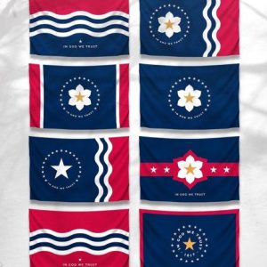
Photo courtesy of Kirk Thorton
• Give us a little background on who you are and what draws you to graphic design?
I grew up in Madison, Mississippi, and like many kids growing up in the South, I spent most of my youth enjoying the outdoors and playing sports. From a young age, I was interested in art, drawing, and creating things with my two hands. It wasn’t until high school after my first graphic design class that I realized design wasn’t just something that I enjoyed but something I could make a career out of doing. I’m drawn to graphic design because to me it’s similar to solving a puzzle or playing with legos. You take all these parts and pieces and build/unearth ideas to communicate, inspire, and captivate others.
“design wasn’t just something that I enjoyed but something
I could make a career out of doing.”
• How did your experience with us here in the Art Department influence your design path/journey?
My time at the Art Department was a huge step forward in my path to becoming a designer. I went from doing art as a hobby to being fully immersed in the world of art and design. The most important thing I learned in school was to always be thoughtful in your choices as a designer and don’t just create something because it looks cool. I heard this from each of my professors, whether it be in graphic design, ceramics, figure drawing, painting, etc., as to always have intention behind your decisions as an artist.
“always be thoughtful in your choices as a designer and
don’t just create something because it looks cool.”
• How long has it been since you graduated, and what are you up to these days?
It’s been four years since my BFA thesis show in the Fall of 2016. I spent my spring semester section hiking on the Appalachian Trail, which was an absolute blast. In the next three years, I worked as a graphic designer at Mad Genius, a full-service advertising agency in Ridgeland, Mississippi. I’ve recently moved to St. Louis to follow my wife’s career, and I just accepted a job in marketing at a major commercial real estate firm.
• What compelled you to want to be apart of the Mississippi flag update?
When I heard they were taking submissions for the flag, I thought, wow, what an opportunity. Being from Mississippi, I can’t think of a much more significant accomplishment than to have had a part in designing the state flag. Also, I think of myself as a visual problem solver, and man did our former flag have problems. This was an excellent opportunity to design a flag that all Mississippians could be proud to fly. I also knew that if I didn’t submit any designs that I’d be kicking myself if the committee chose a poorly designed flag when I didn’t even have a dog in the hunt.

Photo courtesy of Kirk Thorton
• Can you tell us more about the research that went into the project?
I had never designed a flag, but I recalled a 99% Invisible podcast episode I’d heard a few years back all about vexillology (the study of the history, symbolism, and usage of flags). I went back to that episode for a refresher, and I studied up on the basic principles of flag design from the book Good Flag, Bad Flag How to Design a Great Flag from the North American Vexillological Association. Next, I looked through the 49 other state flags. I knew some great flags from the top of my head like New Mexico, Texas, and Tennessee, but was I surprised by the amount of poorly designed flags with their state seal lazily slapped on them.
• What was your thought/design process in developing the campaign, and can you expand upon what goes into your development process as a whole?
After a refresher on flag design, I realized that this project would be very similar to the approach I take when designing a logo. When creating a logo, I always keep three rules in mind: A logo must be appropriate, distinctive/memorable, and simple. You can learn more about this approach from world-renowned designer Sagi Haviv. So when I put pencil to paper, I knew that I was looking for something that feels appropriate for the state of Mississippi. A design distinctive enough to persist in your mind, memorable enough where if you see it once or twice, you should be able to describe it to someone or a child can draw it, and simple enough to be reproduced at any size.
With these three rules and some symbolism in mind, I begin rough sketches until I feel I’ve exhausted all options. Next, I picked a few of my most robust sketches and start vectorizing; keeping the designs simple makes this process much faster! During the vectorizing process, I’m always tinkering with the designs, often ending up with an artboard exploding with several variations. Finally, I narrowed down these options and started throwing them into photoshop mockups to see how they perform in different environments. This was especially important for this project since a flag is very rarely seen static on a white background. It needs to look good waving in the wind against a bright blue sky, on a t-shirt, or even on a hot air balloon.
“When creating a logo, I always keep three rules in mind:
A logo must be appropriate, distinctive/memorable, and simple.”
• What is some of the symbolism and meaning behind your designs?
I hit on several notes of symbolism in my exploration of flag designs. Many of my designs feature twenty stars symbolizing Mississippi becoming the 20th state to join the Union. I also used a large central star to symbolize a united Mississippi. The Magnolia is the state flower and tree of Mississippi. I used the Magnolia to symbolize the natural beauty of our state. Another common theme in my designs was the use of waving stripes to represent the Mississippi River, the five geographical regions of our state, or the three nations that once ruled over the territory. My color palette consisted of Old Glory Red, Old Glory Blue, white, and sometimes gold. I chose to stick with the colors from the American flag because the similarities between the color palette create a connection between the flags.
• Is there any significance to the typeface you chose to feature in your designs?
The typeface used is Two Lines English Egyptian. This typeface was produced in 1816 and is considered the first sans serif typeface. This typeface would have been available for use when Mississippi was declared a state in 1817. It would have been considered groundbreaking and progressive to incorporate a modern yet timeless font like this into the flag design.
• Was it difficult staying within the state’s guidelines and vexillologist’s parameters?
I wouldn’t say it was difficult to stay within the state’s guidelines. The guidelines given were:
-
- Only unique flag design submissions that include the words “In God We Trust” will be considered by the nine-member commission. Flag descriptions will not be considered.
- The new flag design cannot include the Confederate battle flag.
- Flag design submissions must adhere to principles of the North American Vexillological Association.
The guidelines were pretty straightforward, however, I was disappointed that the flag was required to include text as a guideline because one of the basic principles of flag design is to not include any text. Unfortunately as a graphic designer sometimes you’ll have to abide by rules you don’t agree with. I also made sure that any design that had any inclination or feeling of confederate symbolism was removed from the selection.
“Unfortunately as a graphic designer sometimes you’ll have to abide by rules
you don’t agree with.”
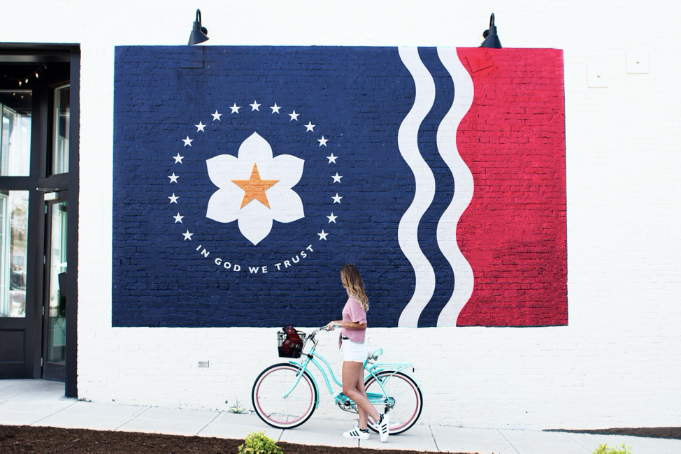
Photo courtesy of Kirk Thorton
• About how long do you think the project took from concept to execution?
These designs came to fruition very quickly. I started seeing other designers posting their submissions on social media and I realized that I was only days away from the submission deadline. I’d say the entire project took about two days of work and a couple of days afterward building engagement on social media.
• How did it feel seeing your 8 flags make it to the second round?
It was a pretty good feeling considering there were almost 3,000 flag submissions.
• After seeing the other entries, would you have approached the project any different?
Yes, I actually worry that I gave them too many designs to choose from, as I normally only show clients 3-4 designs. I’ve found that any more can become overwhelming and folks tend to start combining designs, which in the end is what the committee chose to do. These Frankenstein designs as I call them are often never as strong as the original.
• Seeing the final five, do you have any critique or thoughts on the final 5 selected? We all love a good crit here in the Department of Art and Art History!
Oh man, I could go on and on about the selection of the final five flags, but I’ll try to keep it short. First off, I want to say that I was very glad that The Great River Flag designed by my new friend and fellow Ole Miss alumni, Micah Whitson made it to the final five! This thoughtfully designed flag based off the 1798 Territorial Seal is full of symbolism and has the potential to rebrand the state of Mississippi in a new and positive direction. This flag is in accordance with the principles of flag design and in my opinion, is the only well-designed flag left on the board.
Now for the other four flags in contention, there are several issues. All these flags feature a magnolia in some form which I feel is a great symbol to represent our state (I used it myself), however, these magnolias are far too detailed to be sewn on a flag. Remember the design should be simple enough that a child could recreate it. One flag in particular incorporates the western border of the state. When using this in the design, it is way too literal of a design element, as well as causes problems when the flag is viewed from the backside. These flags also lack the amount of symbolism that was placed into many of the options that did not make the final five.
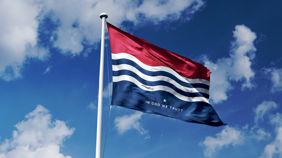
Photo courtesy of Kirk Thorton
• Lastly, what are you currently working on, and do you have any other personal projects in the works?
I’m currently working alongside designer Micah Whitson and a team of extremely talented individuals to campaign for The Great River Flag. This is the strongest option in the final five and I feel it’s my public service to the state to do everything in my power to ensure Mississippi has a well-designed and meaningful flag. So if you’ve made it this far in the interview, please go vote for The Great River Flag and share it however you can.
As far as personal projects, I’ve been freelancing on the side as a hobby for years, and I’m ready to start taking it more seriously by building my personal brand and creating my own design company. That’s what’s next on the horizon.
Hotty Toddy!
“I feel it’s my public service to the state to do everything in my power to ensure Mississippi has a well-designed and meaningful flag.”
Check out the entire case study and more of Kirk’s work on his portfolio site: kirkthornton.net